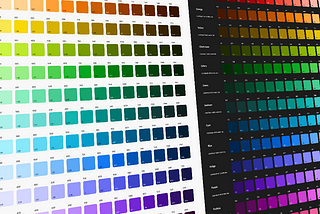
InSkyscanner ExperiencebyAdam WilsonHow we fixed Skyscanner’s broken colour paletteWe untangled a complex web of colours so distinctive brand moments could live alongside accessible, usable interfaces.Jan 30, 20243Jan 30, 20243
InUX CollectivebyArpit GuptaYou don’t need hundreds of colors to design your UI color systemHow I minimized random hex values in the production codebase and Figma to achieve a more systematic, scalable, and consistent color systemOct 14, 2023Oct 14, 2023
InWix UXbyMoria CohenColor alignment for multiple design systemsHow to deal with color alignment challenges in a single productMay 16, 20221May 16, 20221
InBootcampbyGregory Muryn-MukhaPerception-based color palettes for customizable UI themesChoosing the right color space to generate contrast-consistent palettes based on human color perception for user-adjusted UI themes.Feb 6, 20222Feb 6, 20222
InUX CollectivebyLodestar DesignThe “dark yellow problem” in design system color palettesWhen defining a proper color palette for the design system I was working on, I came across the “Dark Yellow Problem”, where designers try…May 28, 202231May 28, 202231
Nate BaldwinAccessible color for design systems just got easierOver two years ago, we released Leonardo: the first-of-its-kind contrast ratio based color generation tool. Since then, Leonardo has…May 9, 20222May 9, 20222
InAtmos.stylebyOndřej PešičkaLCH is the best color space for UI | Deep dive into color theoryLearn about the benefits of using LCH over the now popular HSL color space, and why you should make the switch.Apr 16, 20221Apr 16, 20221
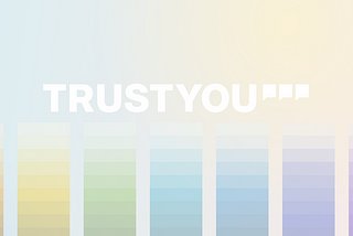
InTrustYou EngineeringbyCarlota AntónA Ui color palette based on accessibilityTrustYou’s new color paletteJan 23, 2022Jan 23, 2022